Crooked Water Spirits Creates a Humdinger of a Label with Cast and Cure Holography

Midwest-based Crooked Water Spirits achieved a great deal of critical acclaim over the last few years by introducing a variety of distilled liquors, including vodka, gin, brandy, and bourbons, as well ready-to-pour cocktails, based off of vintage recipes from the Roaring ‘20s. With the initial success of the cocktail mixes, it was a logical next step to release to CWS fans one of the key ingredients of the cocktails: a bitter orange liqueur.
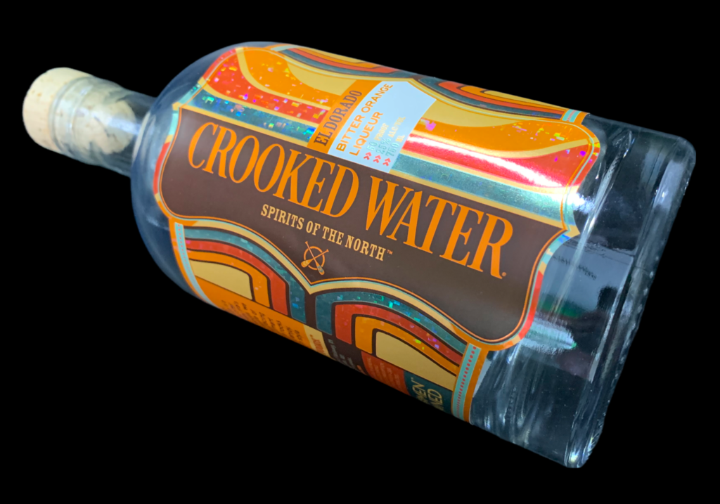
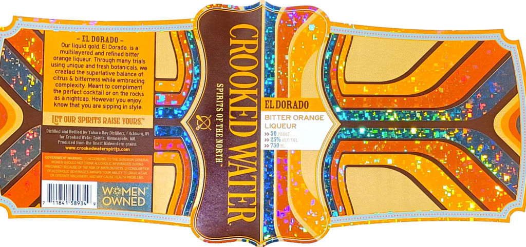
So in 2021, CWS owner Heather Manley and Creative Director Rhett Ambrose started work on the design of the bottle label for the new liqueur, which they called El Dorado. They designed the label to reflect the retro aesthetic while emphasizing the extraordinary nature of the liqueur’s namesake: the 16th-century lost city of gold, just waiting to be found in the mountain mists by an adventurous conquistador.
When Ambrose presented Manley with the orange, teal, and burgundy Art Deco label design, she knew immediately that it reflected the spirit of the liqueur’s appellation. But she wanted a little “something extra”—an embellishment that would set the label apart from the rest of the bottles on the liquor store shelf. So she was pleased that when they asked the production team at Viking Label and Packaging for some ideas, they suggested utilizing holography.
Although CWS had printed their earlier labels on metallic paper, they had never used holography. Yet Manley was intrigued. “I’ve always loved the eye-catching look of holography but had yet to find an opportunity to use it… until now,” explains Manley.
What sealed the deal was when they learned that they wouldn’t have to print on an expensive holographic laminate if they chose instead to utilize an eco-friendlier option: holographic cast-and-cure film.
“Although finding a sustainable option for holography was not at top of mind when designing the label,” says Ambrose, “we were stoked to learn that our customers would be able to easily recycle the label… and that the film waste was not only recyclable but also minimal, due to the fact that it can be reused multiple times on press.”
After reviewing the 25+ holographic patterns available to them, they decided on a geometric square pattern as it was eye-catching and created a surprising contrast to the curving lines on the rest of the label.

“I’m always pushing for a little extra and the cast-and-cure holography on our El Dorado label allowed us to dial it up all the way… to 11!”
Heather Manley, Owner, Crooked Water Spirits
To complete the design, Ambrose set up the print file as 4/c + opaque white, with non-text areas masked for the holography. They finished off the label with a matte overlay to protect it against scuffing. Since Viking Label printed the project on a flexo label press, they were able to apply the colors, holography and protective overlay all in one pass. The result was, as a Juice Joint owner from the ‘20s would have proclaimed, one “humdinger” of a label.
Customers (as well as design experts) seem to agree. Not only have Manley and her creative team received an incredible initial response from their fans since the liqueur’s release in 2021, but the label design has also won multiple awards, including first place at the TLMI annual printing awards competition and third place in the cast-and-cure category at the 2022 FSEA Gold Leaf awards competition.

